And it’s a tale that’s not over yet. Not by a long shot. As a start, in the Trump era, the longest war in American history, the one in Afghanistan, is only getting longer. There are those U.S. troop levels on the rise; those air strikes ramping up; the Taliban in control of significant sections of the country; an Islamic State-branded terror group spreading ever more successfully in its eastern regions; and, according to the latest report from the Pentagon, “more than 20 terrorist or insurgent groups in Afghanistan and Pakistan.”
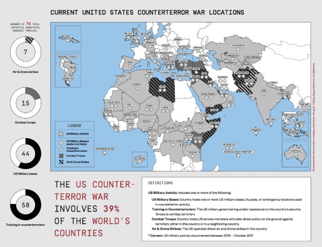
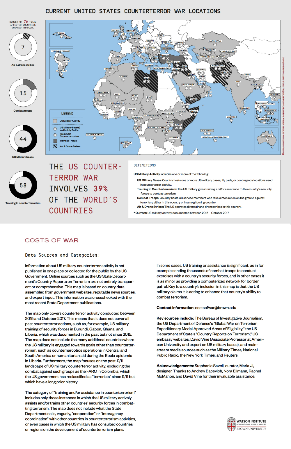
Think about that: 20 groups. In other words, so many years later, the war on terror should be seen as an endless exercise in the use of multiplication tables — and not just in Afghanistan either. More than a decade and a half after an American president spoke of 60 or more countries as potential targets, thanks to the invaluable work of a single dedicated group, the Costs of War Project at Brown University’s Watson Institute for International and Public Affairs, we finally have a visual representation of the true extent of the war on terror. That we’ve had to wait so long should tell us something about the nature of this era of permanent war. …
A glance at the map tells you that the war on terror, an increasingly complex set of intertwined conflicts, is now a remarkably global phenomenon. It stretches from the Philippines (with its own ISIS-branded group that just fought an almost five-month-long campaign that devastated Marawi, a city of 300,000) through South Asia, Central Asia, the Middle East, North Africa, and deep into West Africa where, only recently, four Green Berets died in an ambush in Niger.
No less stunning are the number of countries Washington’s war on terror has touched in some fashion. Once, of course, there was only one (or, if you want to include the United States, two). Now, the Costs of War Project identifies no less than 76 countries, 39% of those on the planet, as involved in that global conflict. That means places like Afghanistan, Syria, Iraq, Yemen, Somalia, and Libya where U.S. drone or other air strikes are the norm and U.S. ground troops (often Special Operations forces) have been either directly or indirectly engaged in combat. It also means countries where U.S. advisers are training local militaries or even militias in counterterror tactics and those with bases crucial to this expanding set of conflicts. As the map makes clear, these categories often overlap.
Who could be surprised that such a “war” has been eating American taxpayer dollars at a rate that should stagger the imagination in a country whose infrastructure is now visibly crumbling? In a separate study, released in November, the Costs of War Project estimated that the price tag on the war on terror (with some future expenses included) had already reached an astronomical $5.6 trillion. Only recently, however, President Trump, now escalating those conflicts, tweeted an even more staggering figure: “After having foolishly spent $7 trillion in the Middle East, it is time to start rebuilding our country!” (This figure, too, seems to have come in some fashion from the Costs of War estimate that “future interest payments on borrowing for the wars will likely add more than $7.9 trillion to the national debt” by mid-century.)
Mapping a World From Hell
http://www.tomdispatch.com/post/176369/tomgram:_engelhardt,_seeing_our_wars_for_the_first_time
